MOBILE APP
Market App
for Des Moines'
Downtown Farmers Market
Market app is a mobile application made for Des Moines' Downtown Farmers' Market. The goal was to improve and simplify the experience of visiting the Farmers' Market, by replacing its paper brochure with a mobile app.
This was a collaboration project between the Journalism department, Graphic Design department and Computer Science department at Drake University.
UX Research
UI Design
Visual Design
Prototyping
Presentation
PHASE 0: INTRODUCTION
why did we create this app?
Market app is a mobile application made for Des Moines' Downtown Farmers' Market. The goal was to improve and simplify the experience of visiting the Farmers' Market, by replacing its paper brochure with a mobile app.
This was a collaboration project between the Journalism department, Graphic Design department and Computer Science department at Drake University.
roles
Project Manager: Jessica Lynk
Developers: Adam Goldberg, Amber Smith
Designer: Yee Kwan Lim (Grace) - me!
before we continue...
If you are interested in the nitty gritty details and reasoning, take a look at the complete project!
If not, keep scrolling for the highlights!
PHASE 1: DISCOVERY
background
The Des Moines' Downtown Farmers' Market takes place every Saturday, May through October every year. It has been rated the #2 Best Farmers' Market in America. The Farmers' Market spans nine city blocks, hosts over 300 vendors every weekend, and sees an estimated 25,000 visitors every Saturday!
and so, what is the problem?
As a visitor, how do you quickly find a vendor booth that you want to visit and
navigate the overcrowded Farmers' Market?
what are the constraints?
Timeline
4 weeks from ideation to presentation. We were not expected to complete the development of the app, but have enough for a stakeholder presentation.
Financial
Since this is a student-led project, we did not have any sponsors and therefore have limited financial support.
PHASE 1.1: UNDERSTAND & EMPATHIZE
the plan
The plan is to first understand the problem space, which is the experience of visiting Des Moines Downtown Farmers' Market. I will follow the structure of the Double Diamond Model to help guide my project plan.
I split my plan into 4 main phases.
Phase 1: Discover
Figure out what the Farmers' Market is like and what visitors care about.
Conduct research to gather as much information and data to guide our design.
Phase 2: Define
Start to narrow down specific issues so that we can investigate and design solutions appropriately.
Phase 3: Design
Create solutions to the defined problems.
Create visuals and deliverables to conduct user testing for further feedback.
Phase 4: Reflection
Think about what would be improved and lessons learnt.
starting with research...
Discovery Research
We gathered as much information from reliable resources, such as the Farmers' Market official website, Catch Des Moines website and various news sources. This helped us better understand the landscape.
Ethnographic Fieldwork
We conducted observations at the Farmers' Market to get a clearer picture of motivations and behaviors.
Field Study
We also spoke to a few visitors and vendors on their respective experiences at the market. This helped us understand pain points and solidify our features list using MoSCoW (Must, Should, Could, Won't).
who did we talk to?
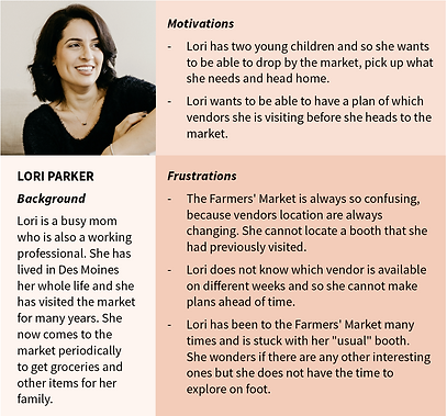
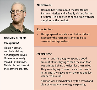
our findings
From the interviews, I coded the transcripts and converted the codes into a few main themes, from there, I extracted the pain points which helped me understand the problems that the app should focus on.
Main themes
-
The size and scale of the Farmers' Market
-
Exploring the Farmers' Market
-
Replenishing supplies at the market
-
Visiting the Farmers' Market with a group (family, friends, roommates...)
-
Time-consuming. Huge crowd and confusing layout.
Pain point
All visitors struggle to find specific vendors using the map printed on the brochure.
Pain point
Visitors do not know which vendors are available on specific weeks.
Paint point
Visitors have trouble navigating and exploring due to the big amount of options.
PHASE 2: DEFINE
initial thoughts
Visitors need a digital solution that can help with navigation, provide latest updated vendors list and pin point vendor's booth location.
This solution should be hand held and can be used by visitors before and during their visit. Considering our constraints and users' needs, we decided that creating a mobile app will be the solution.
MoSCoW
Based on our conversations with the visitors and understanding their pain points, we developed our initial requirements list. With this list, we started to create structures for the content for our mobile app through site maps and user flows.
Must
Filter vendors, List of vendors, Map and Layout, Coupons/Content Marketing
Should
Announcements, List of Musicians, About Us
Could
Vendor Profile, Pictures from Instagram
Won't
Feature to add new vendors
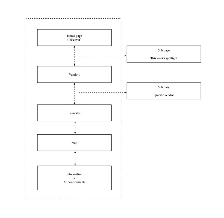
site map
user flow

PHASE 3: DESIGN
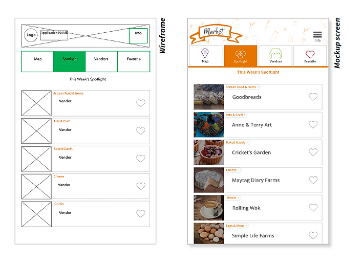
wireframes
Creating wireframes helped me translate the features list into visuals. Seeing how each piece of information fit together and interact also gave me the chance to clear up redundancy and improve user flow (like reducing the number of clicks needed to get to the same point). This entire process is not linear - it required multiple iterations of design and discovery.
Through the wireframes created, I began to zoom in to specific problems that I had defined earlier on.

from wireframes to mockups and to user testing
After consulting the official Farmers' Market website, I implemented design elements to translate the wireframes into mockups. I created low fidelity prototypes to begin usability testing as soon as possible. We wanted to see what the visitors think about our product before proceeding to the next phase.
PHASE 3.1: VALIDATING DESIGN
usability testing
We took our low fidelity prototype to the Farmers' Market a few times to conduct testing. We wanted to understand users' behaviors when using our app and to validate our ideas. We asked visitors to complete a task using whatever way they think appropriate to get to the end of the task.
Task: Find Boesen the Florist using the app.
With this task, we are trying to validate a few ideas:
-
Efficiency:
Can users go through the menu to find what they need? -
Information architecture:
Are the categories appropriately named and sorted? -
Learnability and safety:
If the user is unable to guess the category, can they find another way to complete the task?
With every round of testing, we will go through new iterations of the app to address concerns and feedback. Design choices and adjustments were made.

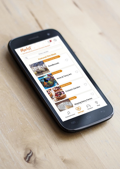
final design

PHASE 4: REFLECTION
lessons learnt & future improvements
At the end of the project, I am relatively satisfied with what the team has achieved within such a short period of time. However, I really felt the constraints restricting my focus and how much I can do and so we really had to pick our battles wisely.
Some of the improvements that can be done in the future include:
-
Navigation. Some sort of walking guidance to a specific booth.
-
Real-time tracking on how busy the market is. This can help users avoid peak hours and plan out their visit beforehand.
-
Improvement on map to include more details, such as the booth numbers for every vendor.
-
More effort on qualitative research. We went through about 2 iterations and I am sure we could have gone though several more iterations and testing to get an even better understanding of our users.
