website & mobile app
Fresh Market
A case study on an online grocery store.
UX Research
UI Design
Information Architecture
Visual Design
Prototyping
PHASE 0: INTRODUCTION
client mandate
Client needs a responsive website that allows users to pick from a curated collection of items and have them delivered within 2 hours. The company does not use local grocers, they have their own distribution hub in the cities they are located in that is the shipping point for all deliveries. The orders come in, they are picked and packed, and then picked up by a driver who then delivers them to the customers. Think Amazon delivery but for grocery. Client has an existing website but it is basic. Client also requested for a mobile app and a branding update.
project mandate
To better understandhow customers (shoppers) think about and interact with Fresh Market online website in order to improve the findability of products and increase checkout rates.
roles
Designer: Yee Kwan Lim (Grace) - me!
before we continue...
If you are interested in the nitty gritty details and reasoning, take a look at the complete project!
If not, keep scrolling for the highlights!
PHASE 1: DISCOVERY
what is the problem? from client's perspective
-
Shoppers struggle to find the right products. Client received feedback that the categories of products do not make sense.
-
According to feedback received, shoppers want to have a way to keep a shopping list for future use.
-
Website is dated and is unresponsive
what is the goal? from a designer's perspective
To understand my client's problems, through the lens of the customers (shoppers who are using the website to purchase grocery). Ultimately, my goal is to improve the shopping experience using logical information architecture that is intuitive and to create responsive design.
the plan
Card Sorting
I need to reorganize and group the products offered in a way that is intuitive. I wanted to use words that is commonly used in the space of online grocery stores.
Customer Journey Mapping
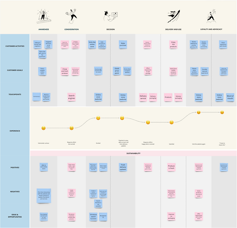
I want to understand the experience of shopping at my client's online platform and the emotional journey throughout the experience.
UI Design for website and WCAG Analysis
Since the client requested a branding update, I created a new look and feel for the design while keeping it accessible.
Aligning the e-commerce site with mobile app
I want to use the same visual language and style to ensure that the website and mobile app are visually and logically in sync.
card sorting
Looking at the list of categories and also referencing to my personal shopping experience and several popular online stores (Hy-vee, Whole Foods and Walmart), I decided to group the products into 8 main buckets. I also created a few subcategories under some of the main categories.
These categories have been widely used in-stores in online stores and so I think users will already be familar with these titles. Further survey and feedback is required to be certain that these categories are effective.

customer journey map
Scenario: New customer
Ellie is a 25-year old Chinese American, young IT professional and she is trying to buy some groceries for the week from Fresh Market online store to be delivered to her home. She also wants to find all that she needs, including some fresh produce and cleaning supplies, from one single store. She is health conscious and would like to get produce that is fresh.
Goals & Expectations:
She wants to be able to get fresh produce and groceries so that she can cook for herself despite her busy schedule. She needs her groceries delivered fresh.

initial findings
Through this journey map, I was able to figure out a few opportunities for improvement.
-
Free shipping and discount for new customers.
-
Broadcast customer reviews with pictures on homepage.
-
Introduce search function and reorganize IA to improve on findability.
-
Order is shipped in as few boxes as possible; improve on packaging when packing both fresh produce and other items in one box.
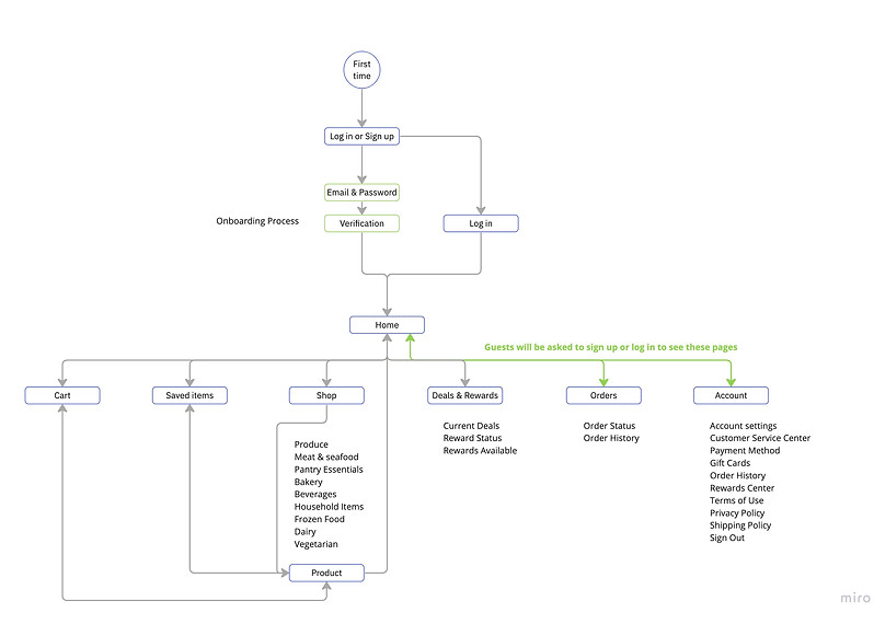
From this list and the client mandate, I developed my requirements list and figure out customer pain points which can lead me to making changes to the existing information architecture (IA). The next step was to create a site map to visually plan out the content and build a logical user flow.
site map

PHASE 3: DESIGN
low-fi wireframes for website
I created wireframes to work out the content and features of the website. This also helped me work through a logical user flow and completed gaps in the flow.

branding and style guide
R65 G131 B9
#418309
R111 G164 B66
#AFD193
R175 G209 B147
#6FA442
Keywords: Clean, fresh, minimal
Colors:
Font: Noto Sans Font Family (Regular, Semi Bold, Bold, Extra Bold)
In order to ensure legibility, I tested my color palette using the WCAG Color Analysis.


PHASE 3: Reflection
goals met
Reorganized the information architecture of the website and created a mobile app that reflects the same logic and structure.
Included features like search bar to improve the experience of finding a specific product. Also included filters and sorting.
Refreshed the branding while staying true to its core values.
website final design

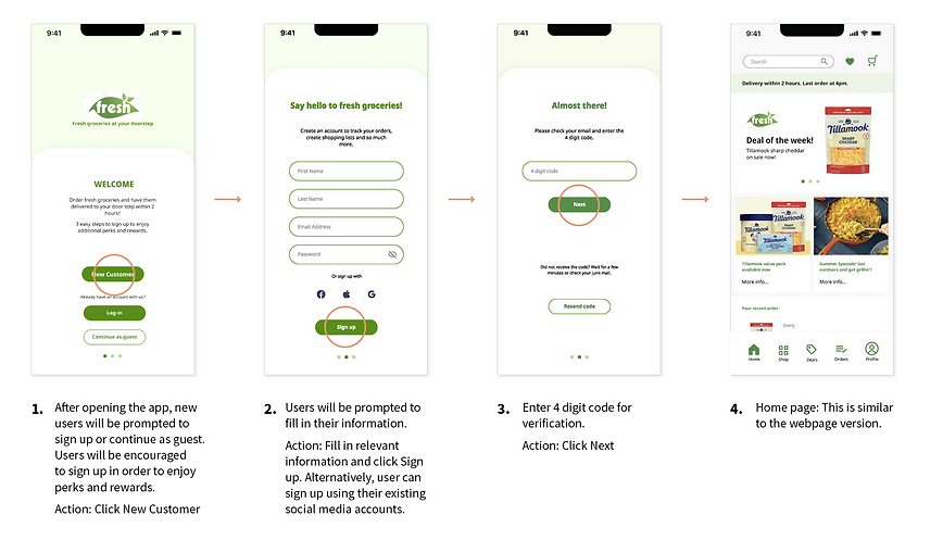
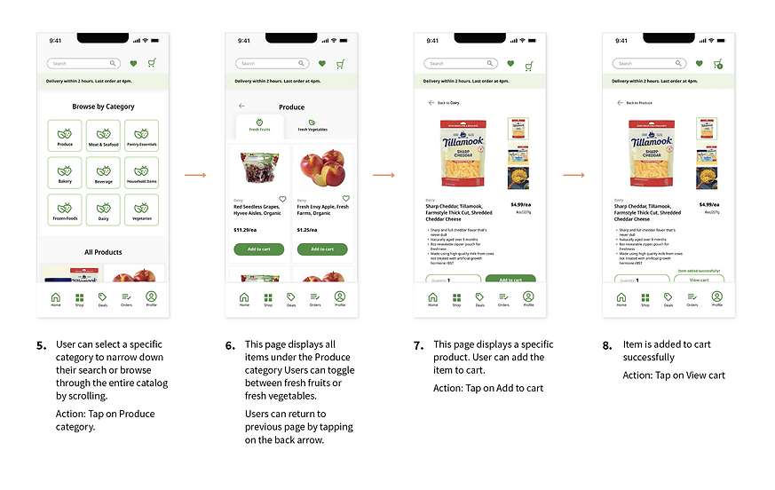
mobile app final design
Based on the established website design, I created the mobile app design. Both products should echo each other in the information architecture and logic structure.


